Friday, 20 September 2013

Visual World Building

For an Auther world building is a complex thing, but for an artist working solely from a visual point of view as useing visuale world building to create stories can be a very powerful tool. If you have a rough idea of what you want to portray in your world, just simple certain elements of what it could contain like my list from earlier (  http://broady-ma.blogspot.co.uk/2013/08/semester-3-start.html  ) i know i have gone into more depth than i should of but i needed to include 'X' amount to feel happy with it, as an artist you can start working. The first painting you do can lead to so many. 

Cave

This was my first for this project and straight from here i was thinking, who are these people? why are the in a cave? whats that big wall? what are them spicky rocks? why are those small flags there? and from those questions to my self i have 5 more concepts to paint showing them again 
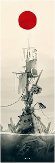
Scientist Seascape


These two paintings came from those questions. from here even more questions emerge, what are the pattens on the rocks? whats the plain? who is the girl? who is the explorer? who does he work for? 

And more paintings came, as well as a story. 

Distant travelers relocating there civilization to a new planet.

Hanger 
the plain. 


savage chief


the girl. 


and then the fisherman i painted earlier, came into light and i could involve him but he felt to techy to be related to the girl but still to rustic to be with the guy. so from these two races adds a third and the story evolves again. 

Relocation to planet, planets current inhabitants are savages compared but over time these distinct cultures adapt to each other. 


And for me this is how i like to approach world building being an artist.   

Tuesday, 17 September 2013

Poster Presentation

This poster shows the focuses of my MA, i hope you enjoy reading through it and i will be uploading more information on world building methodology shortly. 


Sunday, 8 September 2013

Rendering

When you are fully rendering an image all you are doing is tidying up what is already there. Below are all my own work and they are pieces i have rendered to a level where i am comfortable with showing them and they are strong to look at. 

When you are finishing a piece like i already stated you are only finishing whats already there. The difficult parts are already done, you have already worked out the composition, lighting and colour as well as the other fundamentals that should be thought about when working. It may seem difficult to start cleaning up an image and beginning to detail it and it might also take along time but when its done it pays of.  


Remember if some areas work looser keep them that way, don't over detail areas that don't require it. For me me i prefer a brush stroke to say more. 

Saturday, 17 August 2013

Character explorations

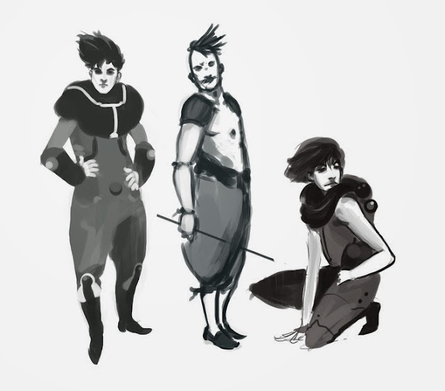
Character exploration, into developing new techniques to emulate water colour feel digitally. Painting with this looser style has brought interesting results. there are areas that don't work but also some that are very strong, especially dry brush emulation. 


From these explorations into watercolour emulation a simple, quick and effective way to quickly mock up images has been found. Useing this style can also be good for a more open and pastel feel. This still needs to be refined however but is a strong starting point to build upon.  

Friday, 9 August 2013

Inspiration Image Set


Set of images from various artists. Each showing different styles and techniques. I can say that each painting was started in a vary similar way, firstly with a rough sketch to understand the fundamentals of the painting and only after that foundation is in place do the more intricate and various techniques used to detail and finalise are used. 

Wednesday, 31 July 2013

Process - Environment


Walk through of painting a scene.

Firstly to block out the major forms that create the scene with correct prespective.

Secondly to begin to apply colour and some more forms to create the base of the environment.


 Beginning to apply textures to the painting and light information. This step starts to detail the piece.


Refinement of the messy areas and adding smaller details.

Friday, 26 July 2013

Concept Artist Techniques and understanding and Own concept art

Concept Artist Techniques and understanding

Borislav Mitkov 


Delicate strokes and in depth under standing of light and tone. Intelligent use of custom brushes. understanding of light, using areas in shadow to advantage and deliberately making them darker so the rest of the piece pops. 


Eduardo Pena 

Quick concepting is a skill required by everyone. The ability to create convincing concepts quickly is invaluable because it allows you to experiment with the subject matter in many different ways before settling on a an idea to take further. There a many ways to make a piece of work that's subject is simply rendered and strong yet that looks unfinished into a more powerful piece by using simply atmospherics. The example above shows some of these, strong light source, rain, dust, for-ground clutter. All of these things create atmosphere and atmosphere can create a strong concept. 


 Alex Raspad
 Colour theory helps to create the mood of a piece. The correct application of colour to enhance work, this example above shows a very strong example to simple colour application over a grey sketch useing blending modes. The use of blending modes to apply colour whether it be just to add hues or to apply light, is a very quick and effective way to work and creates quick results.


Piotr Jablonski aka Niconim


Perspective, structure and composition is the base of a painting if these elements are not correct in the first instance of the work then you shouldn't proceed until they are. The image needs to remained balance in terms of both colour and form.


Kaijia Rudkiewicz


From thumb nailing characters the next step is to realise areas of the design to create a convincing form for the viewer to understand. Above would of started out as a simple black silhouette then grey tones applied on top and only rendered properly in areas that require the detail to make sense. 


 Raveneau Pierre


These light rendered thumbnails, black silhouettes with lighting information applied take thumb nailing further in a different way, exploring the application of light to a form. Certain lighting can create different moods for a character not depending on colour. 


Own Concept Art 


Two colour variants of a futuristic warriors. Application of atmospherics and colour hue to explore subtly different moods. Left being he is an explorer venturing into the unknown. Right being survival, Survival of a long fight and its over, using a warmer shade of green it gives the illusion of a softer mood. 


Application of colour on to a black and white silhouette using colour modes in Photoshop to get the desired effect. Modes used are colour, linear dodge and soft light. Dirt at base of character created by use of custom brushes.  


Base sketch underneath, then paint on top. Going through roughly applieing colour and slowly building detail as i go. Subtle gradients of colour applied and blending modes with it. These gradients and washes of new colour create to varied coloured effect that follows the lighting.